
Logo design & branding
I’m proud to have provided branding and logo design for sectors including publishing, tech, housing, and more.
With branding design, the work doesn’t start and end in a logo. Market research, typography, colours, tone of voice, materials, animation and illustration can all play a role.


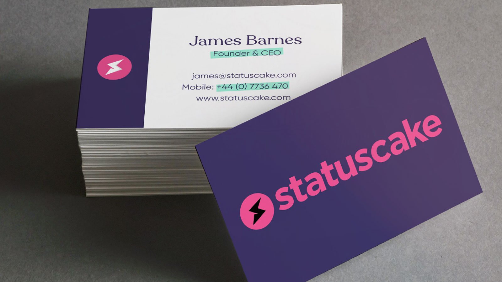
Tech Branding: Statuscake
After working with the popular tech company on a number of projects, StatusCake approached me to redesign the brand they’d had for a number of years.
The resulting designs celebrated the company’s friendly yet professional identity.

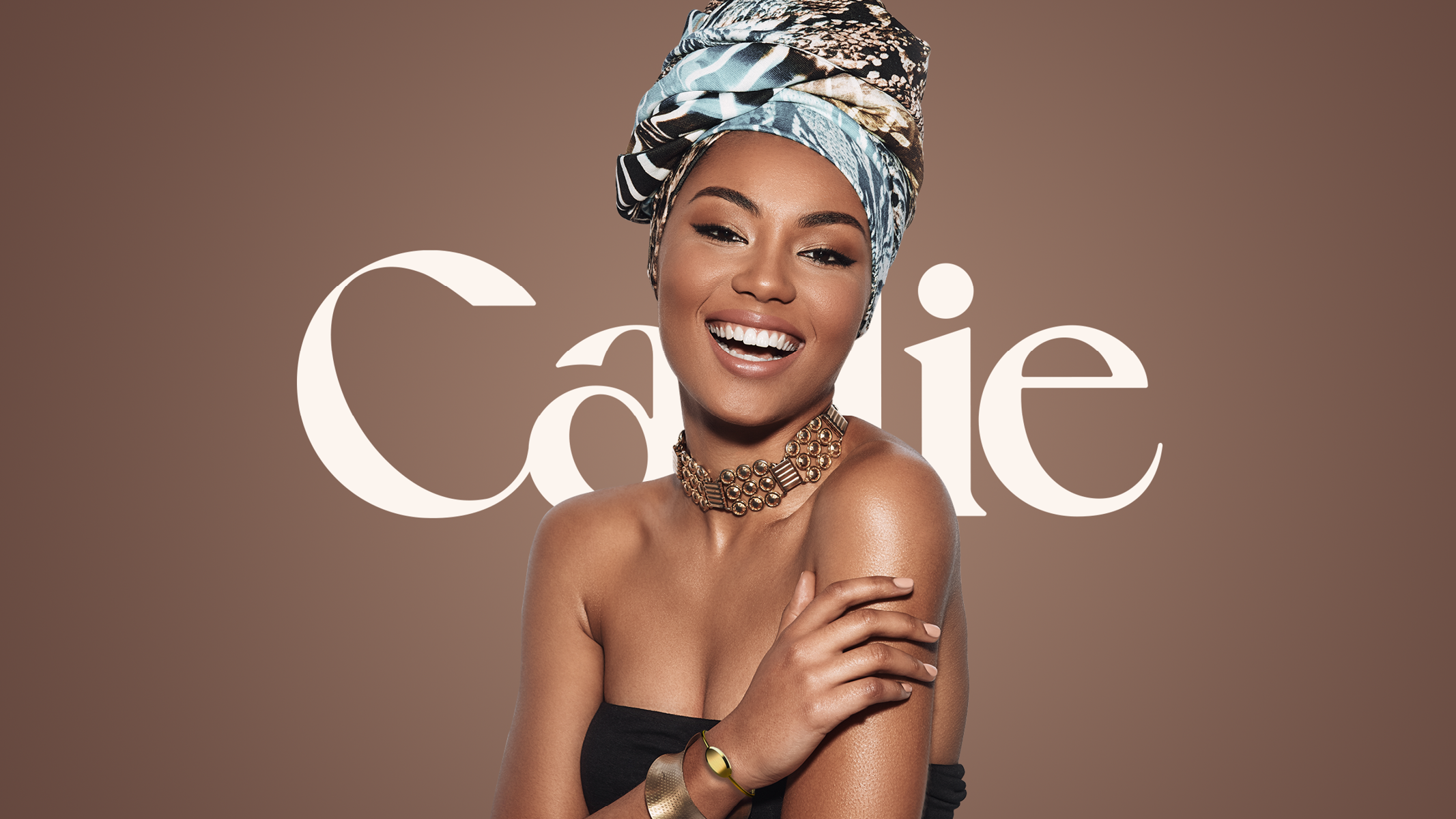
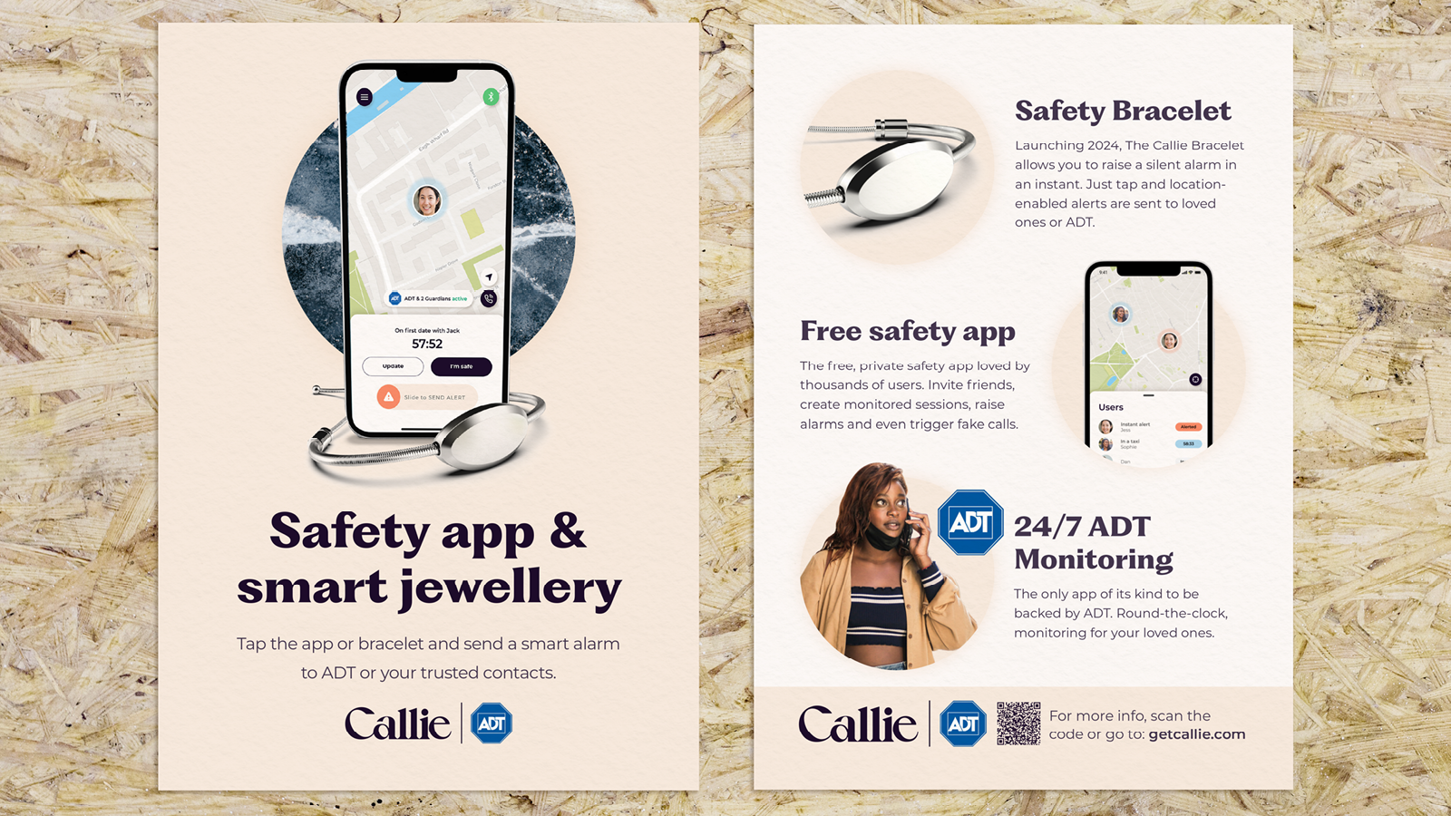
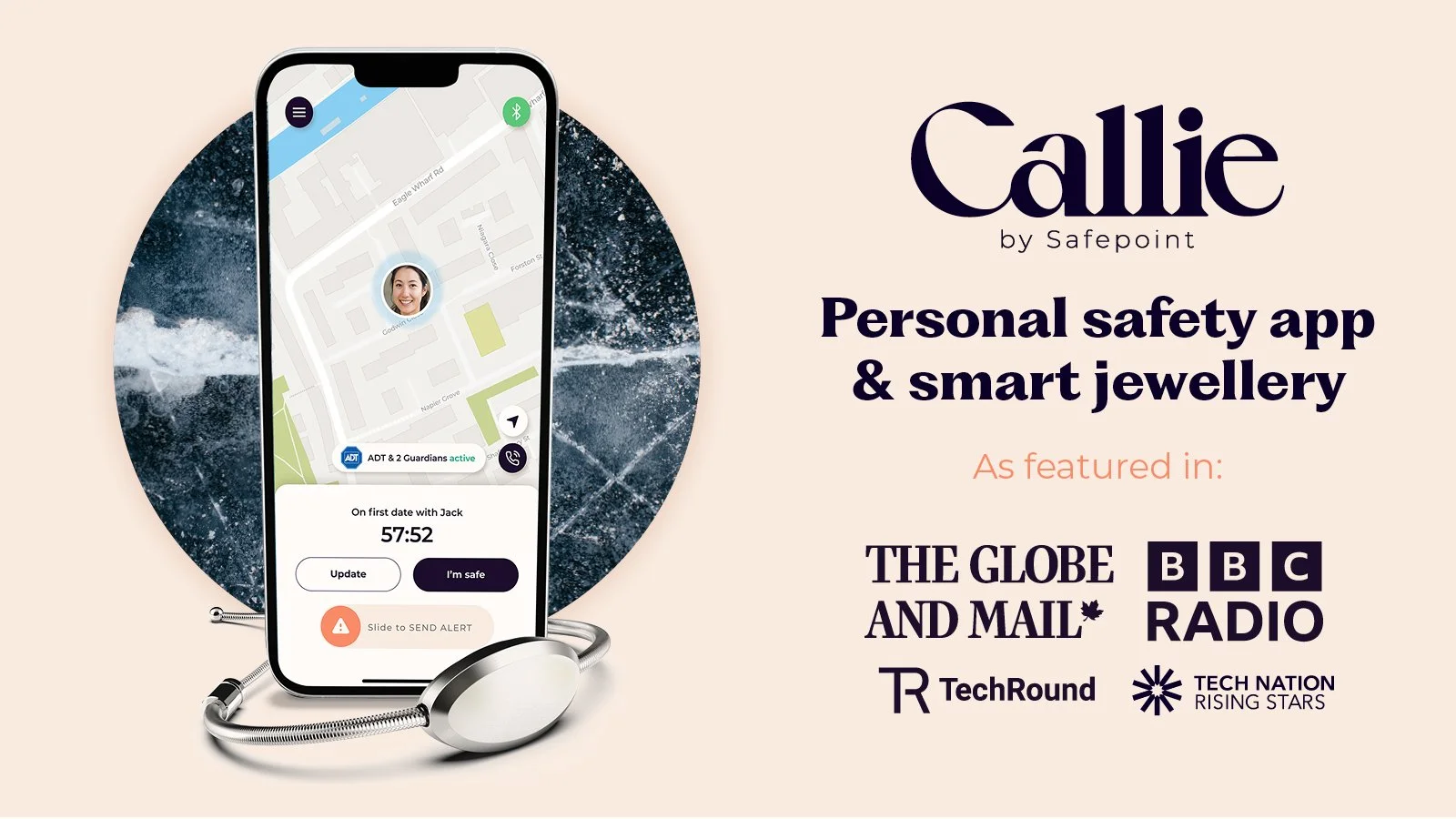
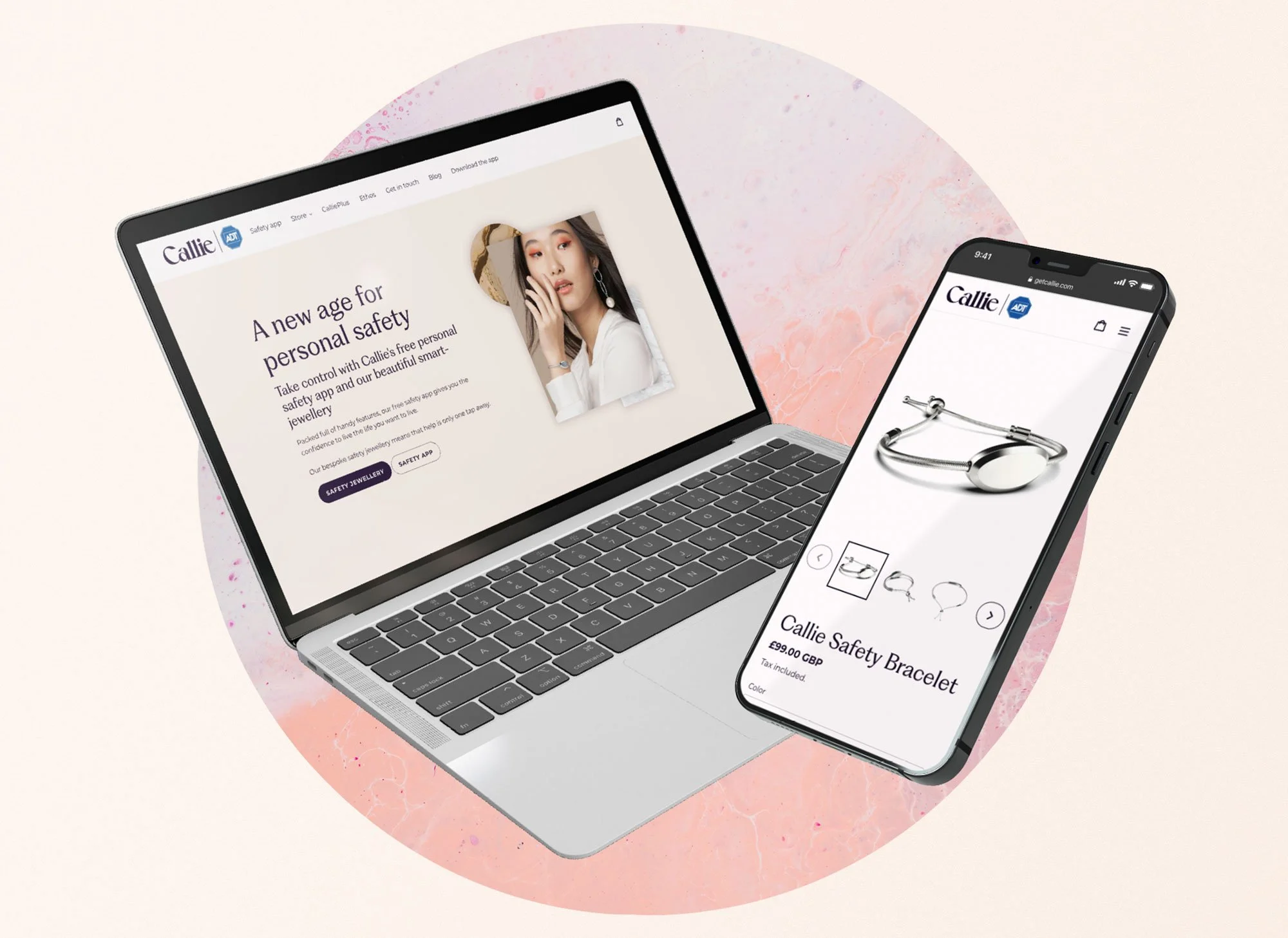
Tech Branding: Callie
When building the branding for Callie Personal Safety, I aimed to capture both the elegance of its fashion and jewellery roots, but also the trustworthiness of the product.
The calligraphic logo mixed with the youthful peach palette and the use of natural textures brought a tactile, high-end feel to this D2C tech company.

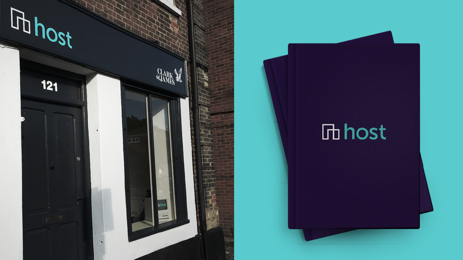
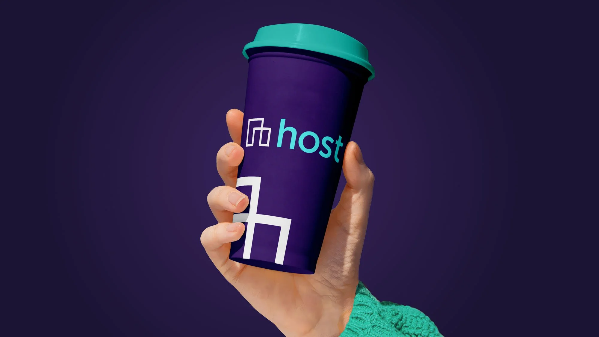
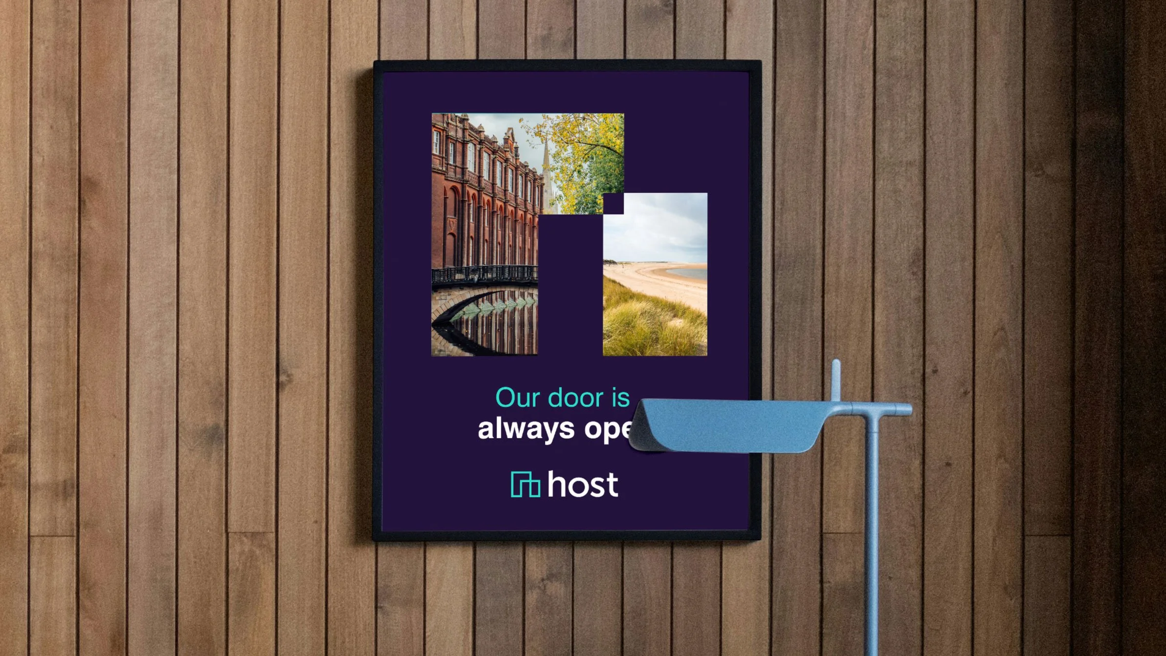
Small business branding: Host Design Studio
Host was a placemaking design studio with history going back decades..
Host’s new brand highlighted their focus on property and location
The chosen icon cleverly combines an abstract “h”, a house with an open door, and a floor plan.
Moreover, the icon balances neatly with the weight of the wordmark.


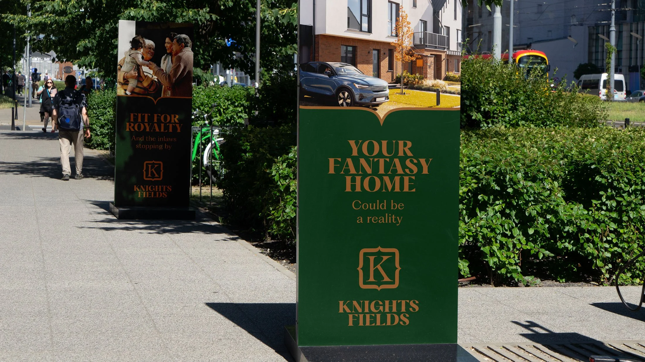
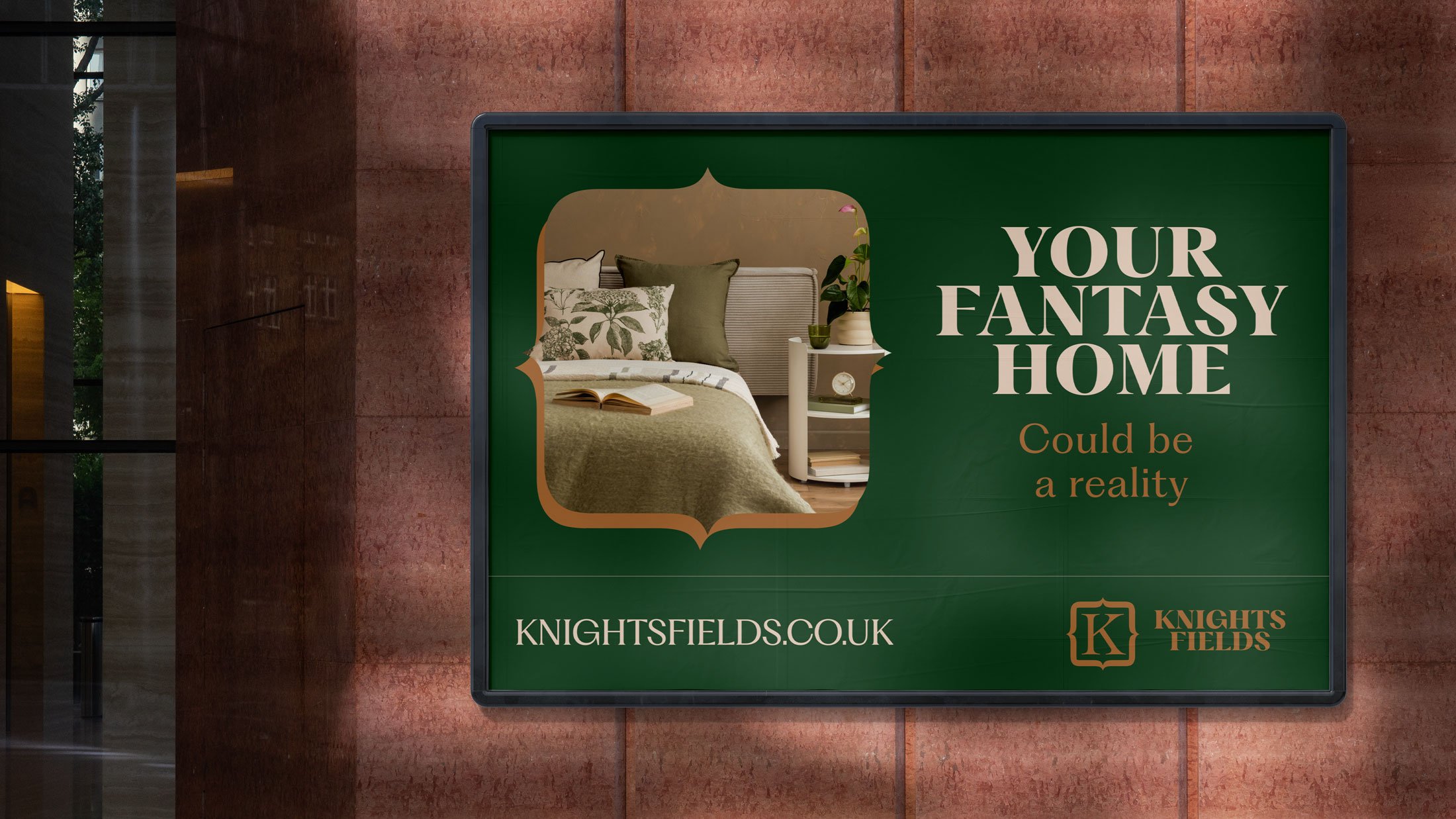
Property Branding: Knights Fields
Knights Fields was a development of new homes on a historic site.
To ensure the design felt quality without feeling out of reach or fussy, the use of regal colours and shield iconography was tempered by a largely typographic solution.

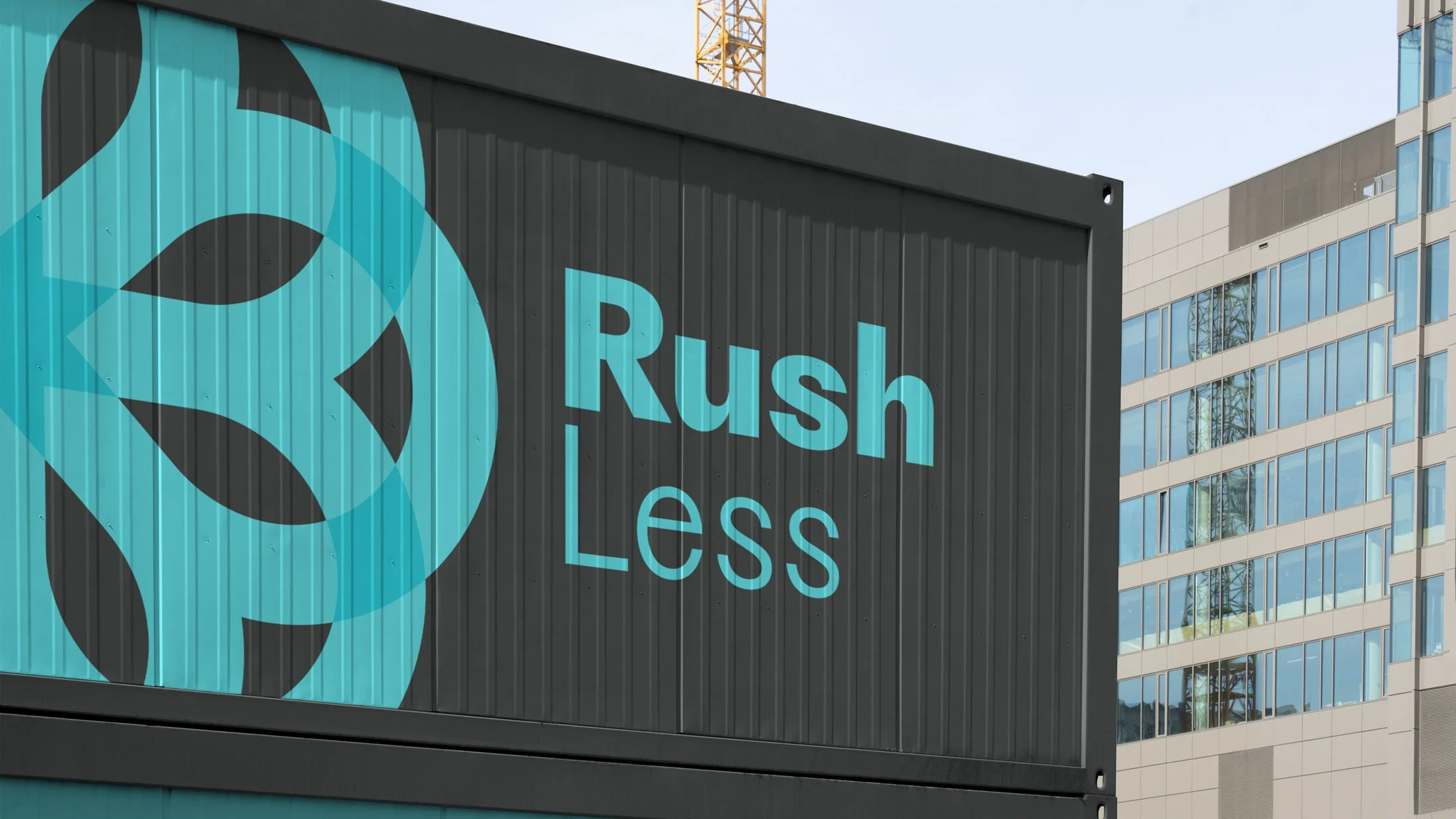
Council / Property Branding: Rushmoor
I created the design for Rushmoor Development Partnership (RDP) in 2019 for Rushmoor Council.
I created the propeller-meets-flower icon to celebrate the region’s rich history of aviation, as well as its love for green spaces.


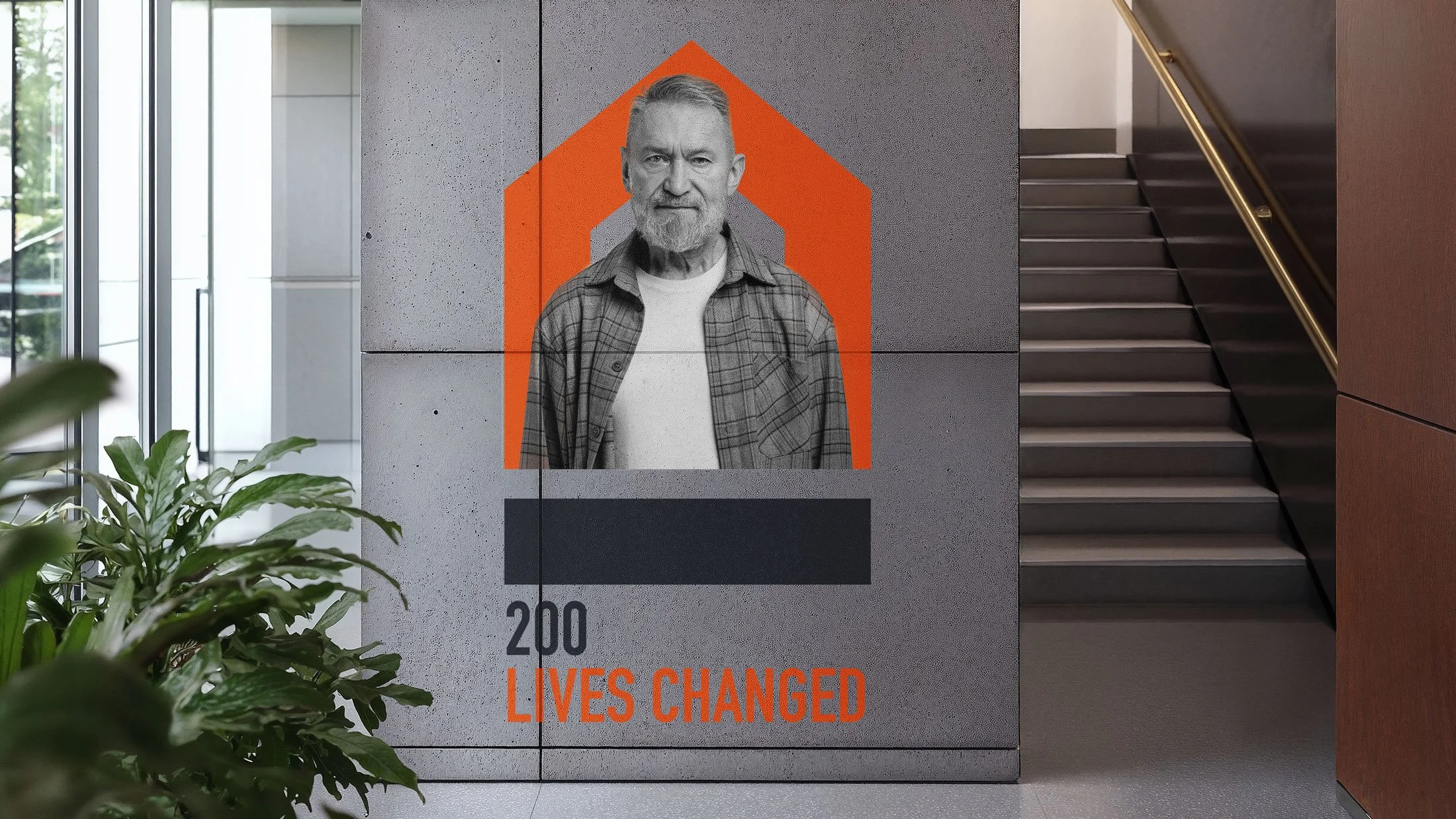
Charity Branding: Foundation 200
Foundation 200 was a homelessness charity project by development group Hill.
While sticking to Hill’s existing colour palette and typography, I created a logo that felt sturdy and respectful.
The icon celebrates the importance of a good foundation when supporting those who are homeless.


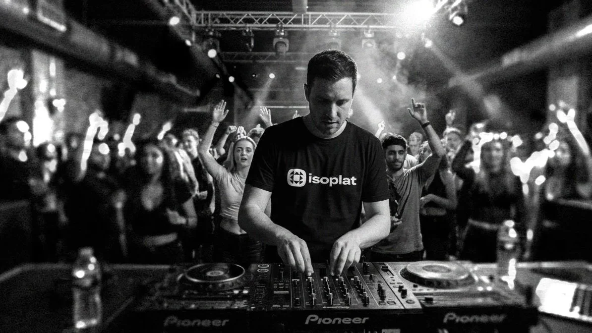
Product design branding: Isoplat
Isoplat built high-quality platforms for sound systems. The platforms isolated the equipment and reduced interference from movement.
My proposed design was made up of a geometric icon – that showcased the platforms’ isolating qualities – paired with a wordmark that was full of personality.
The black and white palette hinted at audiophile quality and an industrial sturdiness.


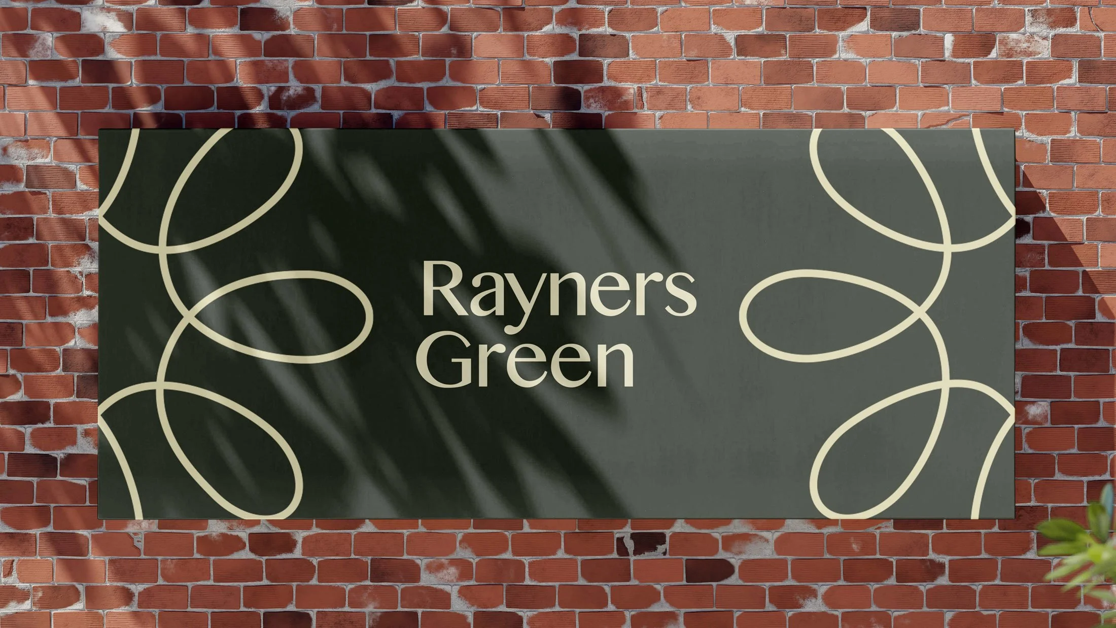
Property Branding: Rayners Green
Placemaking can be a little tricky when a development is not rich in history or unique culture.
For Rayners Green (a new property development), therefore, I proposed a logo that celebrated the area’s lush, flowery landscaping. Adding a bit of geometric symmetry helped make the brand still feel modern.
If you are looking for a Norwich-based branding and logo designer, please get in touch via hello@mattrumbelow.com or 07931812693.
Please note that some designs were made during my work in-house or in a studio, but all shown designs were led by myself.